

Preparing Photographs for Print: Understanding RGB, CMYK and Greyscale Images for Book Publishing
When preparing photographs for a printed book, it is important that images are supplied as CMYK or greyscale, rather than RGB. This is because the way an image is displayed on a screen is fundamentally different from the way it is reproduced using printing inks.
RGB vs CMYK
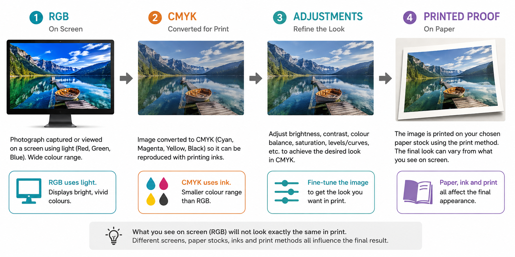
RGB (Red, Green, Blue) is the colour system used by digital screens such as computers, phones and monitors. Screens create colour using light, and RGB can reproduce a very wide range of bright and vivid colours.
CMYK (Cyan, Magenta, Yellow and Black) is the colour system used for most commercial printing. Instead of producing colour with light, the printing press or digital printer uses combinations of inks to reproduce the image on paper.
Because CMYK has a smaller colour gamut than RGB, some colours that can be displayed on an RGB screen cannot be reproduced exactly using CMYK inks. During the RGB-to-CMYK conversion, these colours need to be brought into the printable CMYK colour range.
What can happen during conversion?
When an RGB photograph is converted to CMYK, you may notice some changes to the image. Depending on the colours in the original photograph, the image may:
- Become slightly darker or lighter
- Lose some brightness or vibrancy
- Have less saturated colours
- Show changes in certain blues, greens, oranges or reds
- Have subtle changes to skin tones
- Lose some detail in very dark or very light areas
- Look different overall from the original RGB version displayed on screen
This does not necessarily mean there is a problem with the conversion. It is a result of translating colours from a much larger RGB colour space into the smaller range of colours that can be reproduced with CMYK inks.
Adjusting the image after conversion
For this reason, we recommend that the photograph is converted to the appropriate CMYK colour profile first and then adjusted, rather than making extensive colour adjustments to the RGB image and expecting it to look identical after conversion.
Once the conversion has taken place, the photographer can make adjustments to the CMYK image to achieve the desired appearance. Depending on the image, this may include:
- Brightness/Exposure: Adjusting the overall lightness of the image if it has become too dark or light.
- Levels or Curves: Fine-tuning highlights, midtones and shadows and restoring contrast where required.
- Saturation: Increasing or reducing colour intensity if the image appears flatter after conversion.
- Selective Colour: Making targeted adjustments to individual colours without significantly changing the rest of the image.
- Colour Balance: Correcting any colour shifts introduced during the conversion.
- Shadow and highlight detail: Adjusting darker or lighter areas to ensure important photographic detail is retained.
In Photoshop, for example, the photographer can convert the image to the required CMYK profile and then use Image > Adjustments > Levels, Curves, Colour Balance, Hue/Saturation or Selective Colour to refine the image. It is generally preferable to make these adjustments on adjustment layers where possible, as this allows the changes to be fine-tuned without permanently altering the original image.
For photographs that are intended to print in black and white, the image should instead be converted to greyscale and adjusted for contrast, highlights and shadows accordingly.
The printed result can still vary from what you see on screen
It is important to understand that even after a photograph has been correctly converted to CMYK or greyscale and adjusted, we cannot guarantee that the printed image will look exactly the same as it does on a computer monitor.
An RGB screen produces colour using light, whereas a printed book relies on ink or toner being deposited onto paper. The appearance of the printed image is also affected by the paper stock, paper colour, surface finish, printing process and press/digital printer being used.
For example, an image printed on a coated paper stock may appear sharper and more vibrant than the same image printed on an uncoated or more absorbent stock. A cream or off-white paper can also affect how colours and neutral tones appear.
Your monitor itself can also have a significant effect on how an image looks, depending on its brightness, calibration, colour profile and display technology.
For these reasons, the final printed proof is the best reference for assessing how the photograph will actually reproduce. Some images may require further adjustments after seeing a proof, particularly if the photographer has a very specific look or colour treatment they are trying to achieve.
Our aim with the conversion is to ensure the photograph is technically suitable for the printing process while retaining as much of the original photographic appearance as possible. However, some degree of colour variation between the RGB image viewed on screen and the final printed image is unavoidable.
If there is a particular look the photographer is trying to achieve, we recommend that they make their colour and tonal adjustments after the CMYK conversion, while viewing the converted file, so they can compensate for any changes introduced during the conversion before the book is printed.
Please let us know if you have any questions about preparing the images or the required colour profile for your particular book project.